12 Fabulous Bullet Journal Yearly Spreads
One of my favorite parts of using a bullet journal is setting it up for a new year.
This post may contain affiliate links. Please see my full disclosure for more information.
My bujo wouldn’t be complete without a yearly page spread.
If you are new to bullet journaling, you’ll probably want to read this post, the beginner’s guide to bullet journaling.
So, I put together a collection of twelve yearly calendar spreads for inspiration.
Hopefully some of these will give you layout ideas as well.
I noticed that some bullet journalists put the entire year on a half page, some take up a full spread, and others combine it with a future log and use two page spreads.
There’s no right or wrong, it’s totally up to you.
Image by @dottedlot
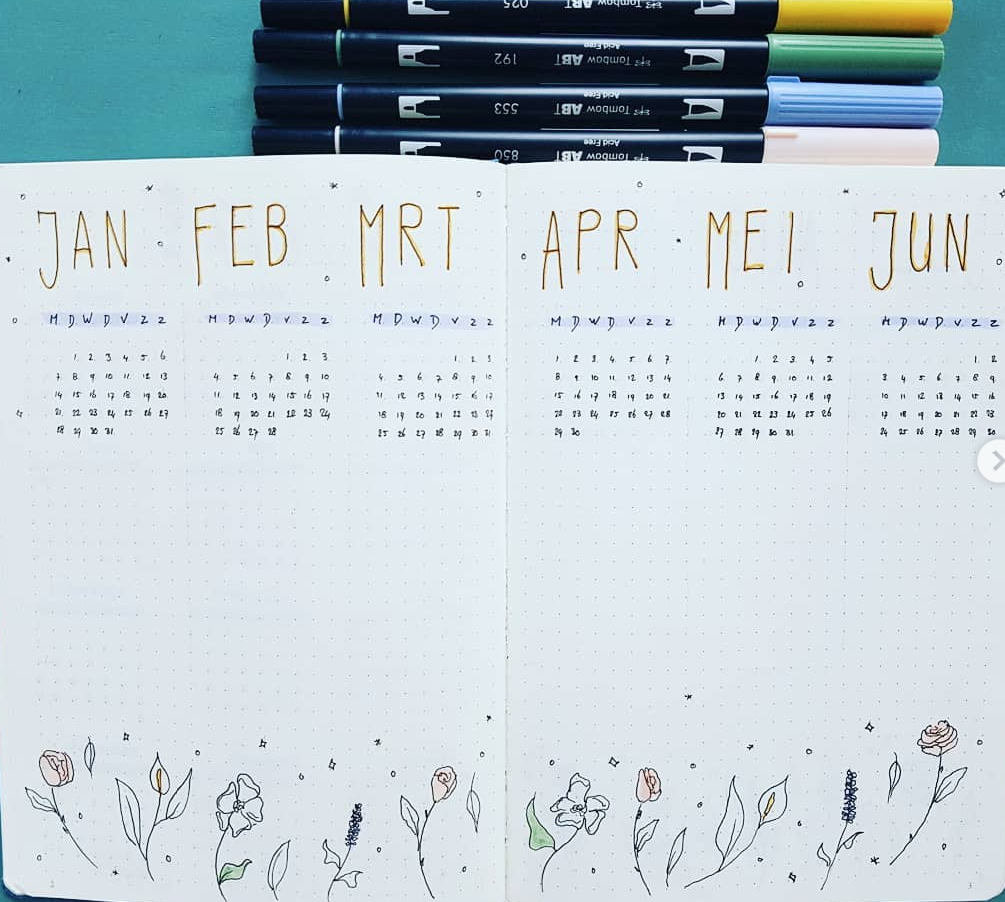
This feminine yearly spread uses spreads total; six months per spread. At the top, simple abbreviate months are atop each calendar. Along the bottom are pretty flowers to frame the page. I’m guessing the middle section has been left open for future log. I love the soft accents created using Tombow Brush Pens.
Image by @__miaww
All twelve months made it on one bujo page. There’s even room for a motivational quote, “this will be a good year” down the right hand side of the page. Days of the week and month number are colored in Zebra Mildliners.
Image by @bujo.by.paula
Here’s another year on one page layout. At first glance, I thought it was all one color. On further inspection, I realized this spread has been created effectively using shades of grey. I love the geometric pattern on the left side and the months written in shaded calligraphy.
Image by @bujo.forlaura
I’m a sucker for buntings (I LOVE PUTTING THEM IN MY BUJO) so even though this spread is from 2018, I had to include it. The year on two pages is very clean and minimalist. The fun flag buntings bring this page to life.
Image by @kaakushka_creation
Give your bullet journal comic book appeal! Using black with grey shadows allows these pages to pop. The page on the left starts with a quote, “adventure begins where certainty ends.” Each speech bubble provides a bit of insight into what we can expect in the coming year.
The page on the right shows the full year at a glance with boxes around important dates.
Image from @jeminaa.sjournal
“Believe the magic of new beginnings.” That’s the quote used to kick off 2019 in this bullet journal. This spread fits the calendar along with a key to highlight important dates such as birthdays, holidays, events, and trips. Colored in with brightly colored markers, this yearly spread pops off the page.
Image by @andantestudies
I wish I could draw lines this beautifully! The year on two pages uses stickers for the months, 2019 header, and adorable pandas frolicking in the corners. I found some really cute panda stickers on Amazon you may want to check out.
It looks like the open spaces below each month provide room for important dates.
Image by @elevestudy
This year at a glance has 4 months down the right hand side of the page and important dates for each month on the left. Noted dates and the months are highlighted with Zebra Mildliners.
Spreading out the months like this provides a lot of extra room, so it’s good for those with a busy schedule. It will end up being year at a glance over 3 pages total.
Image by @teacherwithaplan
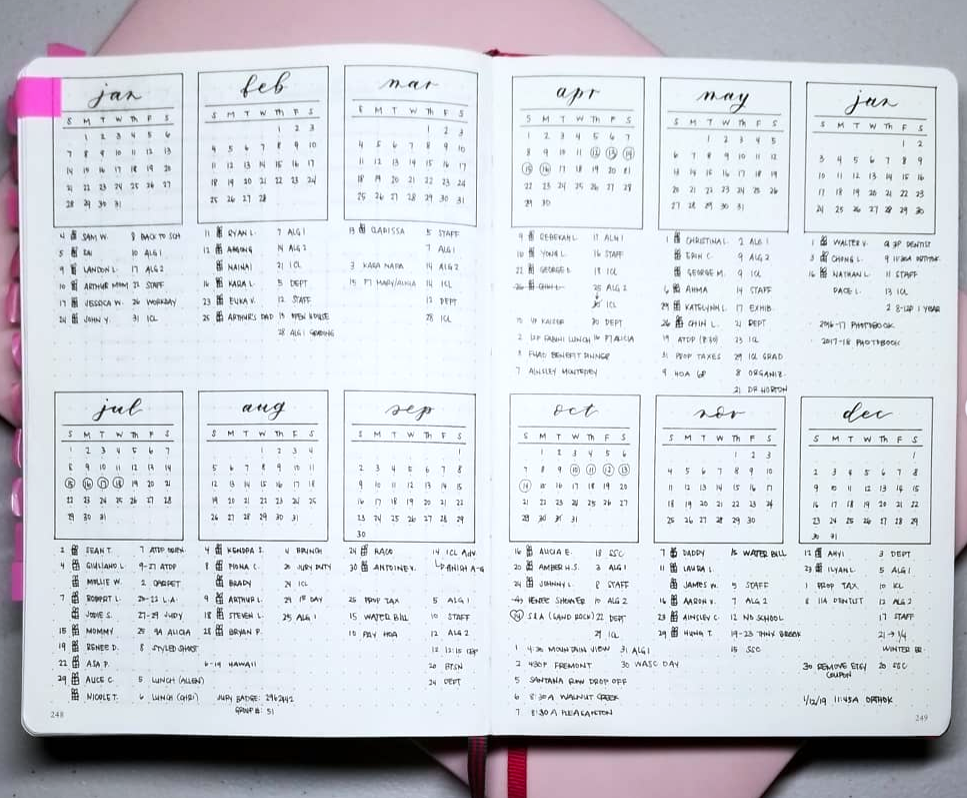
Here’s another calendar spread with future log. Calligraphy writing for the months gives a sophisticated feel and the boxes around each month help provide order. With so much information on one page, it would look confusing without the boxes.
Image by @inking_about_it
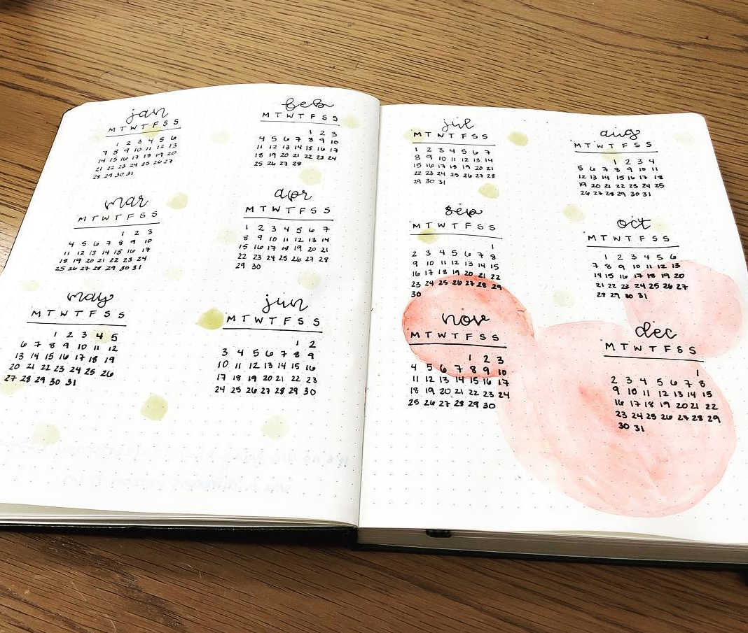
Break out the watercolors! This bullet journalist decided to create a Disney themed bullet journal this year. Each month will be inspired by her favorite Disney movie. The year at a glance kicks things off with a big Mickey Mouse in watercolor.
Image by @plansbythildra
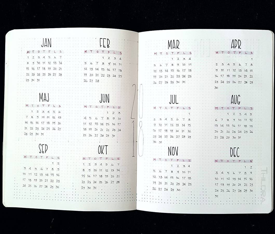
This clean minimalist year at a glance shows the year in the center of the spread. weeks are highlighted in Mildliners. And the finishing touch I almost DIDN’T notice, dots along the bottom of the page have been darkened to create an interesting pattern.
For more minimalist bujo ideas, check out this post.
Image by @everything.handwritten
Taking minimalism to a new high, look at the two years on one spread! Impeccably written months have been perfectly spaced and provide dates at a glance until the end of 2020.
I hope you found inspiration from all of these interesting yearly calendar ideas! For even more ideas, check out this post on bullet journal future logs.
How will you lay out your calendar pages? Do put your yearly calendar on one page or spread it out? Let me know in the comments below.

