Bullet Journal Layout 10 Weekly Spreads to Try
Hey bujo lovers!
Do you like to make the same weekly layout again and again or do change up your weekly spreads?
Out of sheer laziness, I tend to make the same spread over and over. I decided it was time to get creative and start adding more variety to my weekly pages.
This post may contain affiliate links. Please see my full disclosure for more information.
I did a little research and discovered I am missing so much by creating the same old pages week after week!
But before I get into that, if you are new to bullet journaling and want to learn more you might want to check out these articles:
One of the main reasons I love bullet journaling is that it allows me to be creative, but falling into the rut of doing the same layout was stripping me of that weekly creative burst.
So here are some cute, creative, and inspiring weekly spreads that you can incorporate into your bullet journal.
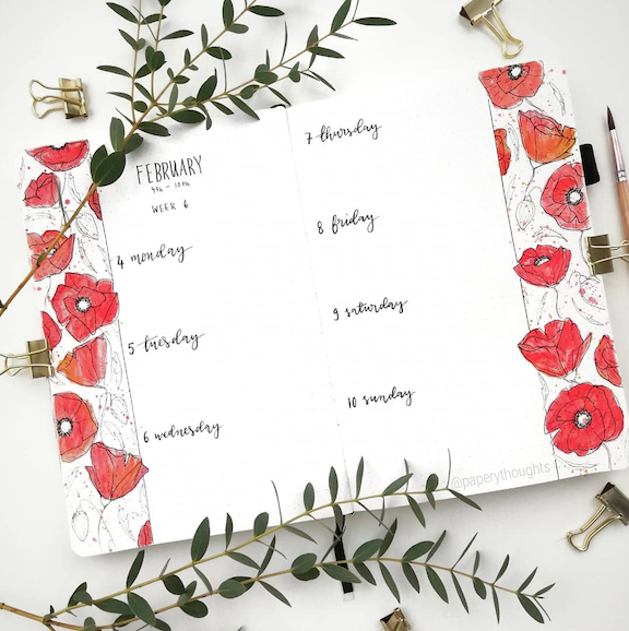
Image by @paperythoughts
Pretty poppies edge the sides of this spread. The weekly layout itself is very simple and minimalist with the days of the week written in calligraphy. The poppy edging is drawn in black pen then filled in with watercolor paints.
Image by @ashandbullets
This is such a simple to make, yet super creative page! The days of the week are envelopes with a note card at the top of each to write daily meetings, tasks etc.
Each envelope has a heart seal in the center. Just above the adorable hand drawn balloon animal is a monthly calendar highlighting what week it is. Last but not least is a to do list note on the lower right corner of the page.
Image by @solliev.m
Here’s a feminine floral weekly page spread! In the center of the page is a beautiful bouquet. At first glance, it looks difficult to draw, but if you take a look at each flower and branch, you’ll see they are very simple to make.
The days of the week are written out and partially framed with more flowers. Three dots at each day provide room to write upcoming tasks and events. There’s even a yoga and meditation tracker at the bottom of the page.
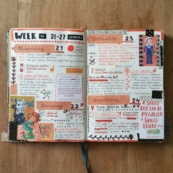
Image by @journal.jungle
In contrast to the minimalist vibe of the previous spread, this page is loaded with stuff! I’m immediately drawn to this page because it’s so much fun to look at.
The creator says she uses it as both a planner and memory keeper. It’s filled with tasks, important dates, quotes, doodles, and lots of cute stickers, washi tape, and cards.
Image by @bujo.ism
Here’s a clean and pretty page that makes me want to set up a spa day. The sprig of lavender in the center of the page as well as the overall color palette reminds me it’s always good to slow down and take a deep breath.
Calligraphy lettering for the days of the week pulls the page together for a lovely one page weekly.
Image by @bujosbyshallyn
Keeping things on the bright side, this week on two pages begins with a large happy sunflower. It’s surrounded by the quote, “keep your face to the sunshine and you will not see the shadow, it is what the sunflower does.”
Across the top of the page are boxes for each day of the week and enough space to write tasks and satisfyingly check them off with a yellow marker. The remainder of the page is dedicated to other important information such as a self care tracker. This tracker includes: devotion, group text, workout, three meal, fruit/veggie, 60 oz. water, sweets free, no spend, vitamin, and one cup.
A daily meal tracker, weekly goals, and rewards complete this effective page spread.
Image by @mochibujo
At first glance, this spread looks like another weekly on two pages. Surprise! It uses a Dutch-door and is actually using an additional page. This technique provides more room to write with while keeping important info (due this week and list) always available to see.
A pretty daisy drawing, washi tape, and mildliners pull this page together for a botanical aesthetic.
Image by @bujoonabudget
Large colorful flowers across the top of this page set the tone for this bullet journal weekly spread. Just below are boxes for recording plans and tasks for each day of the week. There’s a quote, “If we have no peace, it is because we have forgotten that we belong to each other.” - Mother Teresa.
This spread also has a a mini calendar for the month and a box for additional information.
Image by @handmadebyjesslee
This minimalist spread is anything but boring! The weekly boxes are made to look like Polaroid photos with the days of the week written on each. In the upper left corner is a Polaroid with a large palm tree and a beach scene.
Image by @studynus
Making a weekly page spread doesn’t need to take a lot of time. This simple yet pretty page uses purple marker to write the days of the week. Then a black pen to make the page pop as well as add important tasks and appointments. An image glued to the bottom with the quote, “create every day” pulls the colors together.
Will you be trying any new weekly spread in your bullet journal? Which type of layout do you like the most?
Let me know in the comments below.


